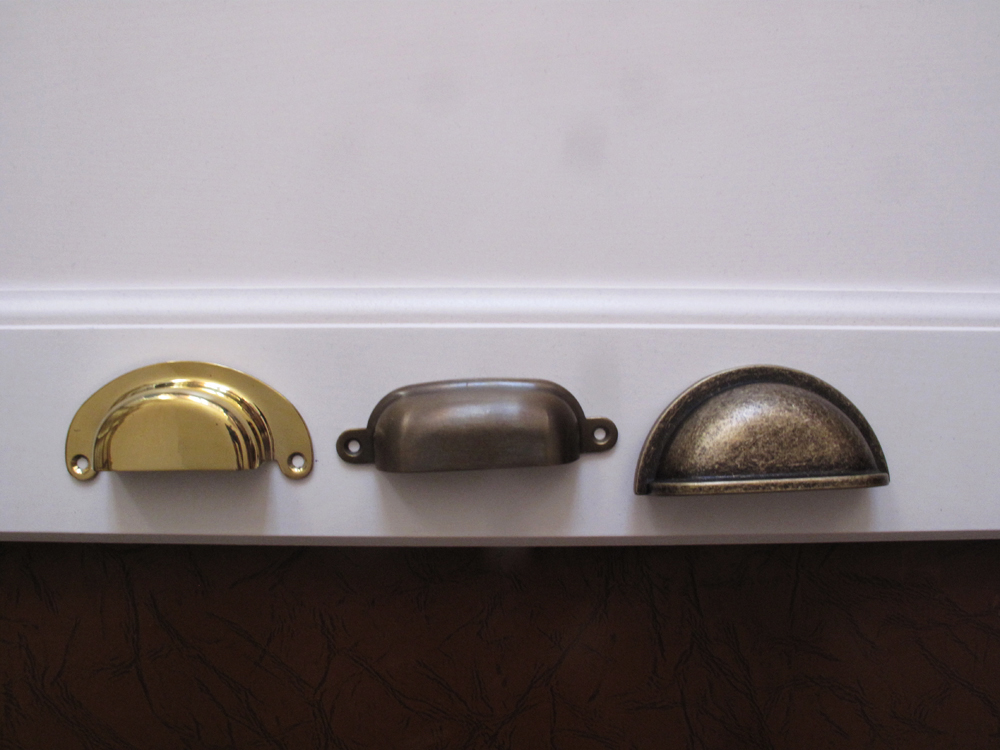
For every renovation project there are really fun and exciting bits (typically involves day dreams of all sorts and potentially shopping – as long as you don’t think about the prices too hard) and the not-so-exciting, one might even say boring or challenging stuff (along the lines of stripping layers of paint). ‘Trying on’ different colors, textures, shapes and sizes definitely falls into the former category ( for the most part) though it has also proven to be a challenging undertaking.
First up, Ikea cabinets. I originally planned on a more traditional drawer fronts, even after some sample pieces spent a few days sitting around our old kitchen. At that point, the winner was Ikea’s Ramsjo style. We liked how it didn’t look plasticky (unlike their other white drawer fronts), although I did have doubts about the whitewash, because it just seemed more pinkish in certain light than I wanted.
At the last minute, I changed my mind and decided to go with plain slab doors in Applad style. I am really glad that I did! First, these doors could really be made by any cabinet maker out there (according to Ikea the Applad style fronts are made in Italy, and I wouldnt be surprised if the same factory that manufactured Ikea doors made these same ones for some fancy European lines). And second, i didn’t think that the look of period- or house style- appropriate kitchen could really be achieved with Ikea cabinets. Plus all the corbels and decorative accents of the Victorian era can get overbearing. Added bonus – in the process of contemplating this whole thing, I came to a realization that I really like the mix of more modern pieces in a traditional setting.
If you look closely both kitchens below have flat front kitchen drawers:
Sources: kitchen by stylist Rosy Strazzeri-Fridman featured on sfgirlbybay.com; kitchen of architects Scott Slarsky and Katarina Edlund featured on elledecor.com
It’s certainly scary thing to undertake- mixing styles-especially since I have never ever designed a room before. The final room isn’t finished obviously, but so far, I like what I am seeing. The mix of classic mosaic floor design and plaster walls looks quite nice with the trendy exposed brick/ reclaimed wood pieces and modern cabinets. The bench seat kind of reminds me of Russian train sleeper cars. And since we already have Russian coins on the floor in the bathroom – it all works together nicely (in my head at least).
Source: Image from here, Russia’s iconic red arrow train between Moscow and St Petersburg.
The thing that I struggled the most with, by far, was (is?) hardware. I knew I wanted brass for sure. But that turned out to be a rather difficult choice. A lot of the hardware doesn’t come in brass, and if it does a lot of it is really ugly 80s looking shiny things. NO! Plus brass fixtures tend to be more expensive. To top it off the first couple of samples I got were along the more traditional lines, which actually I ruled out once we picked the plain slab doors.
So then I tried to spray paint Ikea’s more modern pulls. No muss.
Finally, I came across this kitchen, and these were the pulls. But they were $36 a piece for the small ones! I might have spent the money had I had any. Fortunately, I didn’t.
Source: Canadian Home & Garden
I did find these – Liberty Hardware Artesia pulls. I like them. A lot. I do not love them as much as the ideal pulls, but for the price difference of nearly $1000 I’ll take these any day.
Any reasonable person would have stopped at this. But no – I had a vision of this island in my head. I wanted it.
Source: Bijou and Boheme
So I ordered the requisite pieces. The flat corners here, and the pulls first here, and then here. Unfortunately, the pulls didn’t work out. The first one is impossible to lift because the entire surface is completely flat, the second one must be recessed into the cabinet. And I just don’t have the time/money/patience to see if it can be done.
So I gave up. I just don’t have it in me anymore to pursue this. All the hardware will match on all the cabinets. And it will look good. The end.


