Long overdue. But better late than never, right? The space is not 100% complete, but it looks fantastically close to being done. The one thing we never got to was painting the french doors. I wanted black frames. But there is so much prep work required and so much room for error I decided to put that off until we were back from our adventure. Also, now I am vacillating on whether I actually want the frame to be black — in general I like for things to be as light as airy as possible — the more light, the better.
Overall, we are very pleased with how the kitchen has turned out. We spent a lot of time thinking about the layout and placement of appliances, kitchen work triangle. We also wanted to ensure that we would have as much space as possible to entertain and hang out in the kitchen, and I must say we did really well on that part. We start and finish our day in the kitchen and we love every second of it.
BEFORE
To start off with before — it’s not even the real kitchen before. When we moved into the VIB back in March 2010, the kitchen was by far the worst part of the house. To me it was unusable in that state. I painted the cabinets white, added hardware and a fabric ‘backsplash’ and felt much better about it. Then at some point, I painted the wall gray, because the beige cream was really starting to bother me. Better, but far from ideal. But because we knew we wanted to renovate the kitchen as soon as budget allowed, we elected to spend as little as possible on the cosmetic updates. So this was the kitchen we lived with for exactly two years – from March 2010 to April 2012.
DURING
Although the kitchen was nothing to write home about, the real reason for the hurry on renovation was that the back corner of the house — over where the dishwasher used to be — appeared to be sagging. There was basically a gap between the wall and the floor, and we were concerned that it might be a structural issue. (Thankfully, once we took the kitchen down to the studs it turned out that it was only a joist, rather than house movement, that was causing the gap.) Other considerations for gutting the kitchen, included issues like drywall being attached a whole half a foot out from plaster (really guys??). Plus we were unhappy with the size of our powder room, the layout of the kitchen, the ugly floor tiles. Basically, it all had to go.
We started on the kitchen design back in February 2012, and finally broke ground on demolition the first week of April. We were finally able to use the kitchen just in time for Sergey’s birthday that November, although finishing touches weren’t complete until early 2013! So that’s almost a year. But this was a total transformation, with a rather small budget for a gut job, and with some of the work done by Sergey, me, and our friends who pitched in all the time. Thank you guys!
AFTER
I am not even sure where to begin with my boundless love for this kitchen. There is so much love and thought that went into every single detail, that I cannot chose a favorite. From floor to ceiling everything was chose with utmost care and now makes us happy on the daily basis.
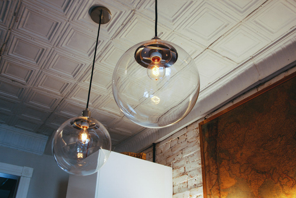
The overarching idea behind the kitchen — as is with the house in general — was to make the box of the room, so floors / walls / ceilings / doors / trim, to appear as if they have always been there, ever since 1897 when the house was first built. I did not, however, want to go for a ‘period look’ when it came time for all of the modern features of this room such as appliances, kitchen cabinets, and lights. The idea is that we don’t really want to feel like we live back in 1897, but do want to respect the historic context of the house. I couldn’t be happier with how this blend of period-appropriate and original details, combined with sleek modern cabinets and appliances, has worked out in this space.
The other big idea behind the kitchen was to make it just about as functional as if it were a studio. True there is no full bath, but with a powder room, a full-length kitchen banquette, and access to the outdoors, you really can spend an entire day here without ever leaving the kitchen. Eat, nap, hang out, do work. We love that, and do spend the majority of our time here when we are home.
On the last note — a special shout out goes out to the heated floors. SUCH a good idea. The floors are set on timers, so my toes are nice and toasty for my morning coffee time.
Source List:
- Heated floor mats: Thermasoft
- Floor tiles: Luxetile
- Paint: Farrow and Ball Cornforth White on the plaster walls; Whitewash on the brick; Benjamin Moore Advance Cloud White – moldings and door.
- Ceiling tin tiles: tiles salvaged from now defunct brass knob warehouse, cornice from tinceilingxpress.com
- Cabinets: Ikea Applad
- Hardware: Liberty Artesia line in Sedona Bronze
- Countertops: Ikea butcher block stained with India ink and sealed
- Island countertop and under-cabinet shelves: reclaimed wood form the original joists that used to support our house
- Dishwasher: Whirlpool for Ikea
- Refrigerator: Fischer Pykel
- Vent Hood: KOBE Insert range hood 700 CFM*
- Microwave: Whirlpool 0.5 cu. ft. Countertop Microwave Oven
- Faucet: Vintage (by the way of now defunct Brassknob warehouse)
- Sink: Blanco Precis
- Over-the-island Lights: West Elm
- Bench: Custom design and build
- French Doors: Weathershield
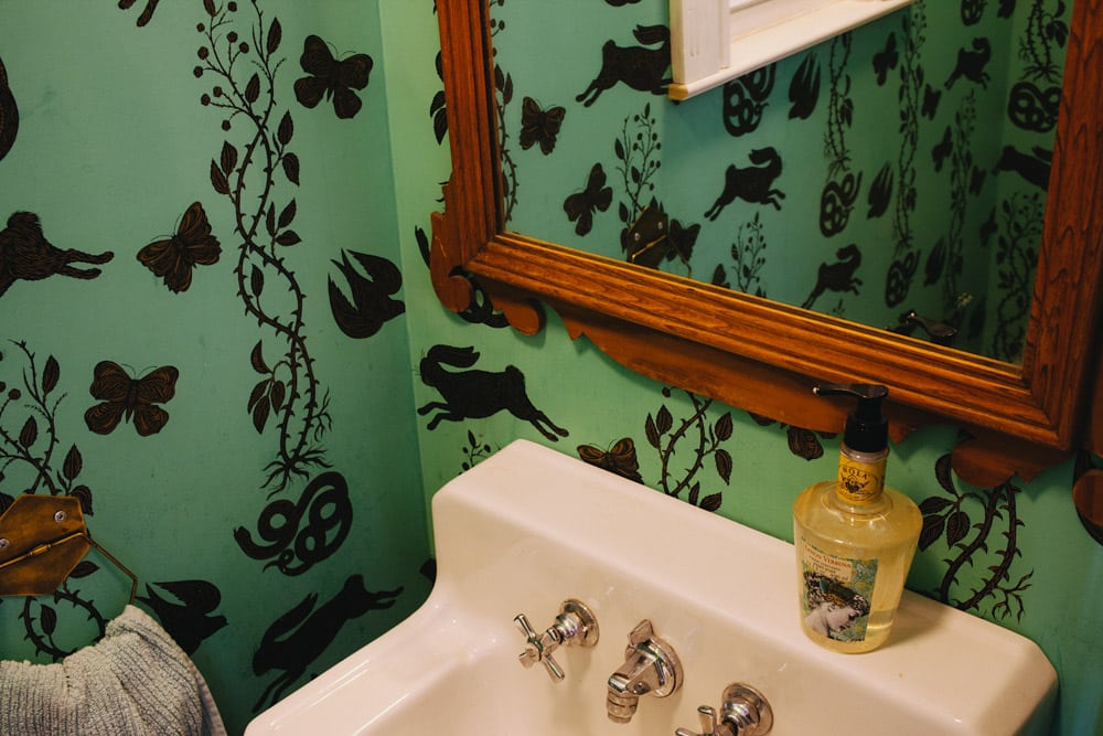
- Powder room and Basement Doors/ Hinges/ Lock set & handle: Community Forklift for the first two, Loading Dock
We are very happy with the majority of our purchases for the kitchen. The one exception is that I would not recommend the vent hood that we got. It functions well, and I love that it is an insert. But it is very loud. Next time, I will spend the extra to get a quieter fan.
The total spent on the kitchen is roughly $40,000. This includes major structural work to replace and buttress our joists on first and second floor, to install the French Doors, and all of the materials and labor that went in to rebuild the space. This sounds like a big number, but when you consider that this was a complete gut with major structural work I think we did pretty well.


