Row houses are quite peculiar–with their depth, width and general size limitations. Not to mention the always dark middle room on each floor (unless you are the lucky resident of a corner unit). And then there’s the layout, which typically means that all rooms are open and can be seen at once on the first floor. I actually love the flow that such layout creates, and I think the specifics of the way our house is set up pretty much equates to perfect flow. All of this presents certain challenges as well as upsides for design. The shelter magazines can be a good source – here’s a capitol hill row house designed by Barry Dixon and featured in House Beautiful last year.


Source: House Beautiful
If you read the Q&A, Dixon explains how he uses the shapes and placement of the furniture to visually expand the small parlor. Another plus – its easy to move the chairs around when company arrives. Also, nooks around the fireplace are both neat and useful for more seating. And then of course there is the whole color scheme – pink and brown aren’t really my thing, but i like seeing how the whole house is still cohesive with white and yellow used elsewhere. I assume that all of the rooms above are on the on first floor.
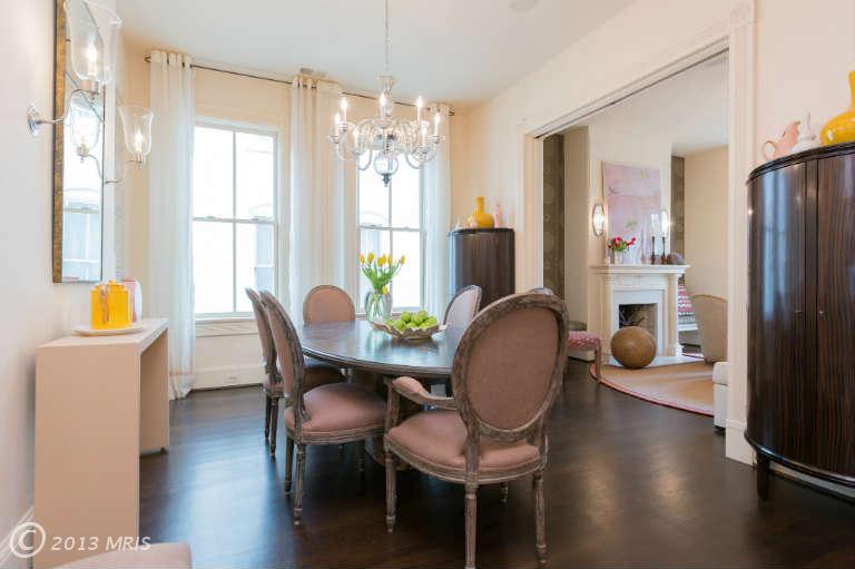
But magazines only publish a small selection of the home, and that’s when MRIS comes is handy (of course if the home is for sale). This one is, and there is much much more detail there to peruse for inspiration. Also available via Urban Turf, though again in a smaller selection that realtor database. Like for example how the kitchen opens up to the family room.


Or for example the transition from the foyer to the living room and then the dining room – since they are completely open to each other after all. Lovely. I could study this all day.
Source: Urban Turf, MRIS


